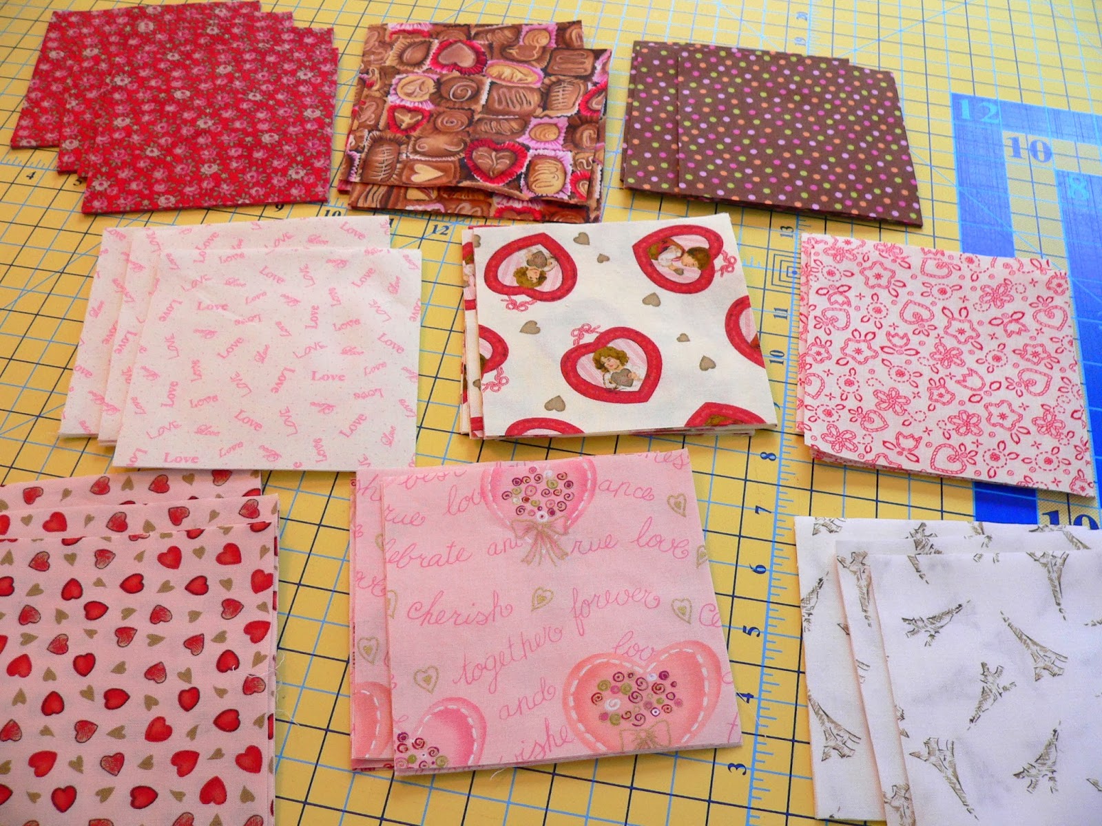
My starter set of fabrics for this quilt is a set of 11 FQs of an early Sandy Gervais line that I won in a giveaway years ago. It is a really nice mix of fun prints but the range of colors is quite limited with 6 medium value prints, 4 darks and only 1 light.

So I turned to my stash in search of some variety and some much needed lights! I wanted to use the chocolates print so I added the brown polka dot and the Eiffel tower print to support the brown tones. I couldn't have a Valentine's Day quilt without a little Robyn Pandolph so I added the mini roses print on red.
 Then I hooked up my iPhone to my speakers, turned on my audiobook and started in. 16 rows across and 19 rows down needed to be filled.
You can tell by the empty spots that I'm going to be cutting some more lights. 14 more squares from 4 of my light fabrics. Look at what I have left on my cutting table - lots of mediums and a few dark squares. Since my mediums are all basically the same shade of pink they didn't play very together in this layout.

Yesterday I was talking with Sara who blogs at My Sewing Room via email and she mentioned using a black & white photo image to check value. I used to do this while exploring watercolor quilting techniques years ago. What perfect timing - thanks Sara for the tip!

I'm linking up to WIP Wednesday@Freshly Pieced and Fabric Frenzy Friday@Fort Worth Fabric Studio.
I think this looks great. Adding in the other fabrics really helped with your range of values. The black and white photograph was a great idea. Have fun tweaking it. Remember to take more pictures along the way, so you can go back to a prior arrangement if you liked it better.
ReplyDeleteRosemary B here:
ReplyDeleteI love this. And the technique to check color value is amazing.
Jasmine's idea is also very good. Wow.
Have fun.
I am doing the math in my graphpaperbook to try to make something like your can of worms quilt with one of my charm packs and some kona white and maybe another color. right now, just graph paper, but perhaps this week-end. Gosh you are inspiring to me.
This is a happy snappy creation! :-) :-) :-)
Love the black and white photo idea. It's pinned and will definitely be used. You're mighty brave to sew such a quilt. You thought the placing of the squares was hard. Wait till you sew it together. Congrats on a beautiful finish.
ReplyDeleteThis is lovely! I really like the way you have shown the color values, too, in the grayscale photo. I liked the original quilt when I saw it, but I love your Valentines' version. <3
ReplyDeleteI have some red/pink/white fat quarters out on my cutting table for another project and I am having a very tough time right now trying to stop myself from cutting squares and laying out one of these pretties on my design wall. I really have too many other projects going right now. I must resist quilty temptation! We shall see if I am strong enough ... ;) Pat
The fabrics are all fabulous, especially with the additions you made. It is going to be a stunning quilt.
ReplyDeleteGlad I could share my tip of using the black and white photo. I made this same design on a much smaller scale from one of the Schnibbles books (can't remember which one). And I had to do the same thing - lay it all out first on the design wall. Then I "lived with it" for a couple of days and kept moving things around. The black and white photo was my way of checking the values.
WOW, that is looking great! I love it and what good advice about black and white photo.
ReplyDeleteLove making the plus design. Like a puzzle.
ReplyDeleteIt does really help to be able to look at it from this view point and see what needs to be changed.
ReplyDeleteThis is a beautifully striking pattern. Thank you for the link to the tutorial, I made a note of it.Good luck with the tweaking, and the quilting.
ReplyDeleteGreat quilt. I love my plus quilt that I made to hang in my dining room. Great fabric selections.
ReplyDeleteThis is great, I love it!
ReplyDeleteGreat project! I love the variety of fabrics you have used, the brown in particular is a surprisingly perfect addition. How nice to have a design wall!
ReplyDeleteYet one more example of why we need to mix fabric lines! You are right--the chocolate brown was essential. No matter how much fabric I have, I always run short of one value or another of something. :-)
ReplyDeleteIt's looking fabulous, Deb. Can't wait to see it finished.
ReplyDeleteI love the plus pattern and will make one soon... I like the idea of checking value! That is very helpful!
ReplyDeleteVery cool!
ReplyDeleteYou are doing a super job on this one! Yes, the lower right needs some changing and moving around...but you will get it figured out. I always tell my WC class to use a black and white photo, even if they are using a value viewer (which is useless for reds). And for working with reds....it is the only way to check. Now you are making me itch to do some value work!
ReplyDeleteI love the idea of using a black/white photo for checking values. I'll have to file that one away in my little head. Sometimes things fall out of my file box up there tho. Thanks.
ReplyDeletelinsquilts.blogspot.com
Awesome Idea!!!! And hey congrats on your win in Jan. ALYofF!!!! :) (Couldn't think of anyone more deserving!!!) V
ReplyDeleteI think it looks wonderful!
ReplyDeleteLove how it's coming along--the black and white photo really helps you determine if you have a good balance of lights and darks!
ReplyDeleteWould love for you to stop by tomorrow and link this up to Fabric Frenzy Friday!
-Lindsey
Fabric Frenzy Friday
It's fabulous! Love this pattern
ReplyDeleteLove this ! Your colours are working so well together
ReplyDeleteI made one of these in a multitude of colours, it's really nice seeing yours in reds, pinks and white - looks very pretty.
ReplyDeleteI am smitten with your pluse quilt, Deb. It's looking wonderful in those reds and pinks with that dash of chocolate. Wow, it's so pretty!
ReplyDeleteLove this!!
ReplyDeleteI have just made a plus quilt. I'm in the process of quilting it now. It's for my new niece Bridget who was born on the 13th of February. I didn't know she was going to be a girl, so bought some beautiful Moda precuts in gender neutral, bright kids colours. I've used yellow background pluses in between. Now looking at yours, I kind of wish I'd waited and gone all out pink 😐. However, it is a beautiful baby quilt still.
ReplyDelete